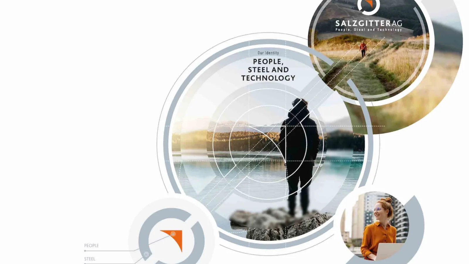
Parallel to the strategic realignment of the Group (see article Closing the loop), Salzgitter AG has also gained a new corporate identity. This applies to the logo in particular that has been redesigned so that it conveys the idea of circularity even more clearly: the two circular segments used to date now come closer to forming a closed loop. Fresher colors and a more modern font give it a more contemporary look. The main and most obvious change has been made to the company claim, however: “steel and technology” is now “people, steel and technology”. This honors the out- standing role that people – i.e. employees, customers and partners – play in the Group as its dynamic drivers and key success factors.
“The adaptation of our brand identity to the new strategy is more of an evolution than a revolution,” stresses Frank Seinsche, who as head of Corporate Design & Events has managed the transformation at the Group end. “It was important to us to build on our existing strengths and logically further develop these instead of just ’greenwashing’ ourselves.” A holistic brand image includes much more than just a new logo, however: new, emotional imagery and a distinctive layout grid have thus also been defined.
Extensive implementation
The motto during implementation was “digital first”, as Salzgitter’s online and social media presence was quick and relatively easy to manage, explains Seinsche. “The process is more elaborate where we have physical logos and imagery, for example in print media and internal and external signage systems, on flags and banners, truck tarpaulins and our ore train locomotives. The gasometer at the steel mill is even more complex. Our new logo is to be applied to the cylindrical building in a format measuring 180 square meters – making a statement that can be seen for miles around.”


